The problem this solves
Someone looking for a lawyer arrives with a situation, not a legal category. Most firm sites answer with an organisational chart: partners, areas, a contact page. The visitor has to translate their problem into the firm's vocabulary before they can tell whether they are in the right place.
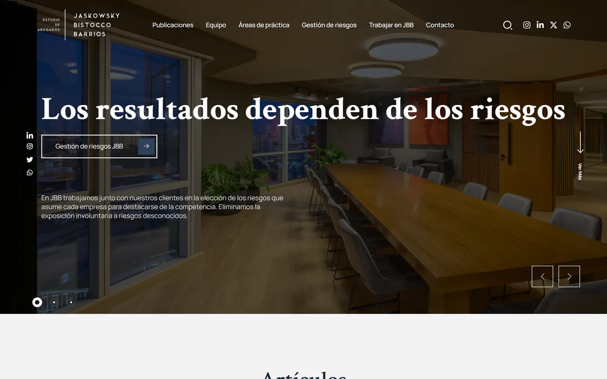
JBB Abogados was organised the other way around. The practice areas are presented so a person can recognise their case, the team gives that experience a face, and the editorial content lets them read how the firm thinks before they decide to write.
From first interest to the inquiry
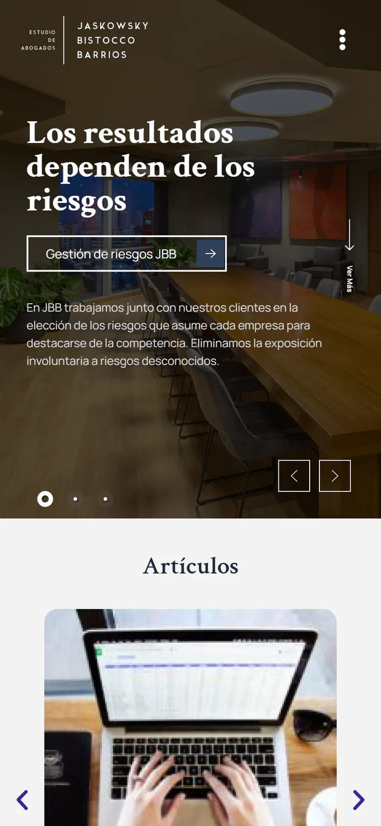
The work combined web design and UX/UI with the development of the sales funnel: which page a visitor lands on, what they need to see next, and how each step points to the same contact. Specialities, team and publications share one visual line so the path feels like one site rather than three sections.
The inquiry is the end of that path, not a button repeated everywhere. That keeps the message a prospective client sends closer to what the firm actually needs to know.
A site that also has to be maintained
A published law-firm site carries an obligation the mockup never shows: it has to keep working, stay secure and be updated as the firm changes. Beyond design and user experience, Tomás took part in the maintenance of the site and in web-security tasks on its hosting environment.
Design and operation in one project is the point: the same person who decided how the site presents the firm is the one making sure it still does so months later.
What the work proves
JBB shows the studio's design side working inside an agency team on a real client, with the whole life cycle of a site in view: structure, interface, commercial path, maintenance and security.
Paired with Rony's systems work, it is also the pattern JAC Studio proposes for institutional sites: a clear path to the inquiry on the outside and a maintained, secured environment underneath.