The problem this solves
An assessment platform has a lot to say and very little time to say it. HR Quotient measures 26 dimensions across 4 levels of professional experience: a proposition that is rigorous by design and, for exactly that reason, hard to take in from a landing page.
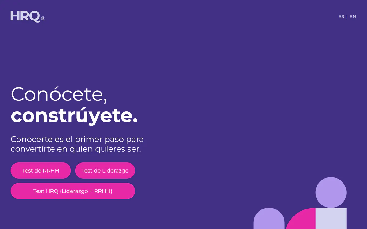
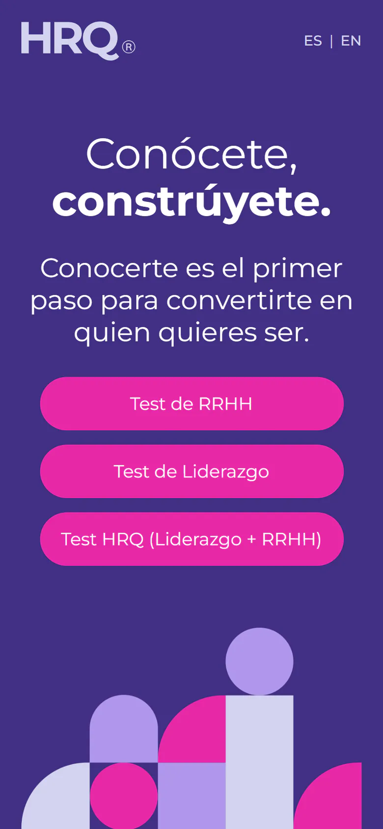
The work was to make that value understandable before asking anyone to start: which assessment fits me, what will I go through, and what will I be able to do with the result.
Research, order, then the path
Research and design focused on the user's questions rather than the platform's structure. Knowing where to start: present what each assessment offers so a person recognises the path that interests them. Moving forward with context: organise dimensions and levels into a sequence that gives the experience meaning. Understanding what comes next: separate the level reached, its characteristics and the recommendations that orient professional development.
That reading ordered the proposition, the assessment and the recommendations into one path instead of three products.
From the Figma prototype to the React front end
Tomás connected the interface design in Figma with its front-end development in React, so the path between HRQ's presentation, its assessments and the reading of results stayed continuous — the same decisions in the prototype and in the browser, respecting the platform's own methodology.
The site is published in Spanish and English, which is why English visitors of this studio are sent to its English version without a language cue.
What the work proves
HR Quotient shows the studio's design side taking a dense, methodology-driven proposition and giving it a hierarchy people can follow, then carrying that hierarchy into production code.
It is the counterpart to Arqvia and CoDesign: where those prove the systems underneath, HRQ proves that the surface can explain something complicated without flattening it.